A Symbol of Unity, Heritage, and Progress

About the Design
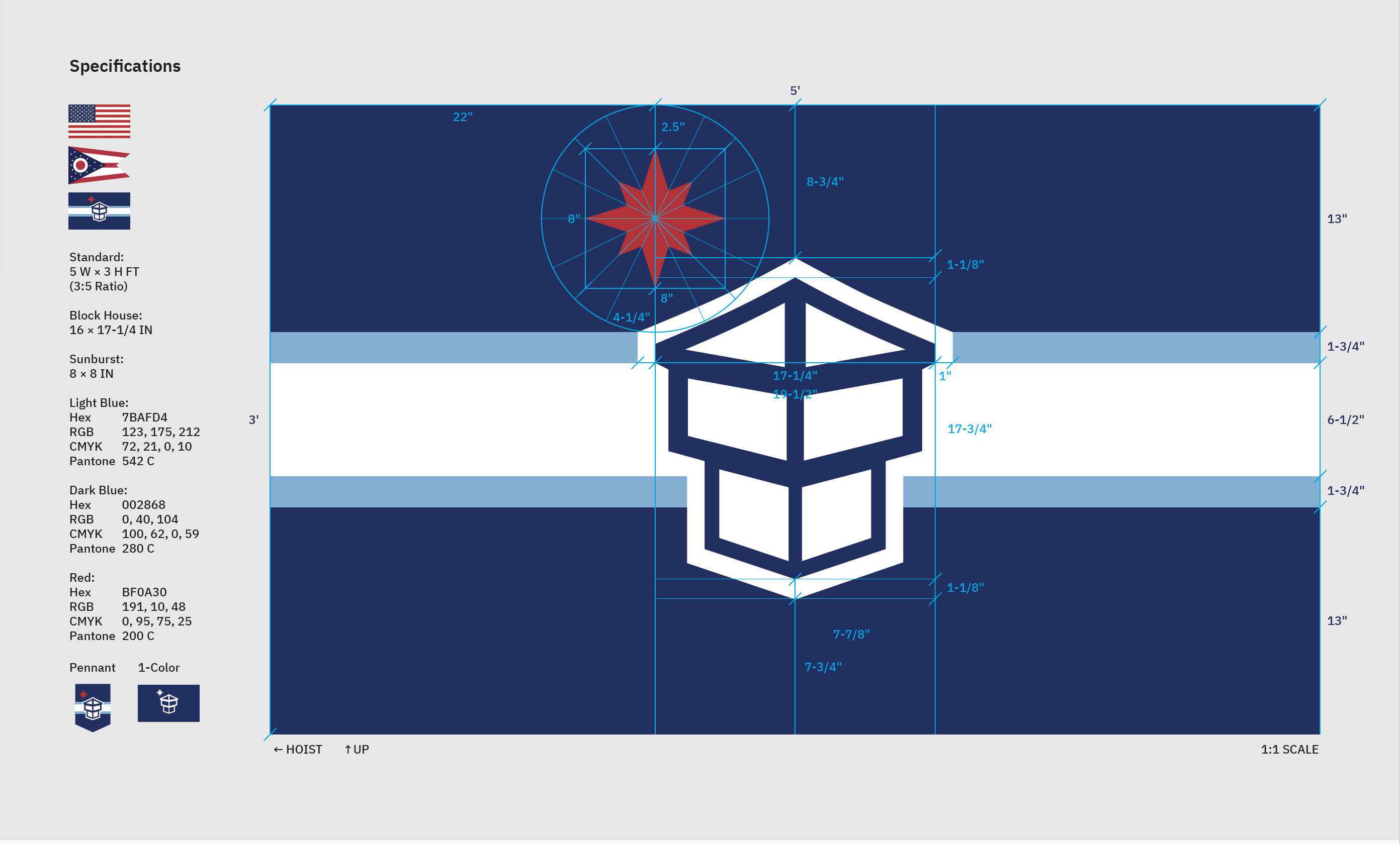
The new flag for the City of Toledo stands as a compelling symbol of unity, heritage, and progress. Central to the design is a modernized blockhouse, representing Toledo's historical roots and industrial strength. Historically a symbol of a fortress, this modernized version now embodies the cityʼs trajectory from challenging pasts into a new era. It showcases Fort Industry, a structured "T" for Toledo, a leaf form that nurtures and celebrates the city's natural environment, and the iconic Veteranʼs Skyway Bridge at the top. Its angled silhouette, inspired by a flint arrowhead, honors the ancestral homelands of Indigenous tribes.
The four elongated points of the sunburst in the top left represent cardinal directions and honor Native American traditions of the medicine wheel, as well as Toledoʼs geographical position as a vital crossroads in America. Reinterpreted from the cityʼs seal, the sunburst is positioned in the Northwest quadrant of the flag, rising on the horizon and connecting with the Skyway Bridge. Placed above horizontal blue bands symbolizing the Maumee River and the tributaries of the region's watershed, the sunburst also landmarks city center.
The flagʼs color palette harmonizes and embodies cultural connections for all Toledoans. Dark blue envelopes the flag, inviting openness, ingenuity, and reflecting the cityʼs legacy as a global innovator. It also echoes the colors of the historical University of Toledo, past Toledo flags, and the Ohio state flag. Light blue signifies the cityʼs water resources, vibrant cultural roots, and stability. A prominent white band symbolizes the unification of all Toledoans and embodies perseverance. Rising and glowing, red represents Toledoʼs indomitable spirit.
This flag is more than a symbol; it is a visual testament to Toledoʼs rich history, diverse culture, and a beacon for its bright future. By reimagining the blockhouse, it opens the door to a new, prosperous chapter unique to Toledo. This design unites the cityʼs population, honors its heritage, and inspires hope for generations to come. It captures the ethos and vigor that define Toledo, ensuring its story continues to thrive.

About the Artist
Mark Yappueying is a designer who magnifies ideas into thoughtful design solutions for cultural institutions and mission-driven brands. Alloyed by curiosity and craftsmanship, Mark has shaped visual identities, exhibitions, publications, and print materials to connect on refined strategies and meaningful impact.
Mark studied at the University of Toledo and has since led transformative design projects for prominent cultural institutions, including the Buffalo AKG Art Museum and the Toledo Museum of Art. Through collaboration and insight, he has crafted visual narratives that resonate with diverse audiences, helping to elevate institutional identities and broaden their cultural influence.
Working across disciplines, mediums, and contexts, Markʼs work emerges from a process of refinement and discovery. Aesthetics and function are not opposing forces but forces that exist in subtle harmony, where every project invites opportunity to deepen design experiences, blurring the lines between form and meaning.
About the Process
Download more information about the Toledo Flag Redesign Competition